Monday 31 October 2011

Sketches for Constructionist poster


These are my sketches for the constructivist poster project. I've been obsessed with the visual of the stand-up bass lately. It says "music" but specifically natural, organic music. I like that. 


Tuesday 25 October 2011

Constructivist Poster Project


These are the Posters that inspired me


 I like this one because i LOVE Tetris. Also, the political implications presented in the poster provoke thought in me. 


This one I like because of its simplicity. However simplistic, the image is recognizable by almost everyone under the age of 50. I also like the adaptation of the propaghanda-style war posters in the Star Wars theme.


This one i find interesting because of the blatant irony. It reminds me of communism but is actually an ad for a super expensive purse. 


I like the use of red and black in this one. and again, it's simplicity. Very stark contrast. I also like the font, especially the "say". 


This final poster has striking imagery. I don't know what it is saying though. I like how the bigger boot exceeds the square limits. I also like the roughness of the cuts. Looks like it may have be done with construction paper and scissors. 

Tuesday 11 October 2011

Letter Project

The Letter i chose was "I". I should say that the letter chose me. I saw the letter within the shape rather than looking for shapes that look like letters.


I imported the image into photoshop. I decreased the brightness and contrast to darken the lighter parts.
I then imported the image in to Illustrator and performed a live trace. I had to experiment for a while with different settings in the trace to get something solid.

Once i expanded the image  i was able to smooth out any left over inconsistencies using anchors and handles. 
For fun i imported the vector file back into PS 
I set up a canvas and arranged several copies of the vectorized image and colored them in using a color palette i found online. 
I went a little further and drafted a mock logo using the "I"

Tuesday 4 October 2011

Logo Project - Final

                               To Begin i imported  the image of four stick men and woman holding hands into PS. I chopped them into just two people and painted them black. I then imported that file into illustrator where i performed a live trace. Once i had my vectorized image i fixed any wavy lines or messy edges.
 Next i imported the image of the television set directly into AI where i performed a live trace. I fixed all the edges to make it smooth. I then added the two images together giving me the "TV Head" stick man and woman.  To add character is rotated and tilted the tv heads. I chopped off the legs of the male's tv and extended the legs of the female's. I found that this further individualized the two genders to make it all the more obvious.
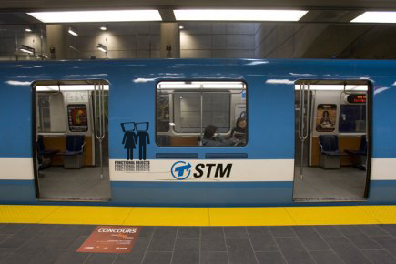
The Idea for "Functional Objects" was directly inspired by street artists such as Banksy and Obey among many others. It is a mixture of familiar things in such a way to make the final product unfamiliar; something that makes a person stop and think.                                                        
I chose to use the stick men type bodies to exemplify how we are all the same. The TVs represent us as brainwashed, misinformed, generic, mediocre, ignorant, etc.
 

men and woman holding hands/ tv's

These are the images i found to use in putting together my logo
 In the end i chose these bathroom sign type people because it is universal in representing people. I chopped them in half just to keep with my original sketch. I liked the idea of using a man and a woman together to represent both genders but also, in a more traditional sense, to represent a modern couple as second generation TV watchers.
 I went with the above TV set because it is simple like the bathroom sign-style people and just matched better.  for the final version you will see that i cleaned it up, reversed, and rotated it. The reversal and rotation made the TV look more human and expressive.
TV i didn't use

 Bathroom folks that i didn't use

Chosen Sketch for logo

the sketch i chose
I felt that this was the most original sketch that really defined the idea of a "Functional Object". Its kind of a cynical critique of modern people; how the general north american watches way too much TV which provides us with a base for morality and fuels misinformation.